The Briscoe Museum: A New Use For an Old Building (with some additions)

                       PART 1: The San Antonio Public Library (1930-1967)

San Antonio Public Library c.1930
1


I've already mentioned the history of the buffalo nickel frieze inside the Briscoe Museum. The present-day building has a long history, and now is one element of a three-part museum with a modern exhibition space and event center, and a sculpture garden.  But the main structure that houses its permanent galleries has had two previous lives, first as San Antonio's second public library, and then as a circus museum.


Prior to this, the site had several uses, and I am providing links below for that earlier history and the politics and process about how it finally became the Briscoe. Here, I'd like to talk about the main building itself.  Its location, at the corner of Market and Presa Streets, just off the San Antonio River, had already housed a Carnegie Library opened in 1903, on land donated to the city by Caroline and John Kampmann specifically as a site for a municipal public library.  This elegant neo-Roman building, typical of Carnegie libraries around the United States, outgrew its space within two decades, and a flood downtown critically damaged it in 1921.  By 1928, architect Herbert S. Green was awarded a contract, first to remodel the old building, and subsequently to design a completely new on to replace it.  It was opened with a lot of fanfare in August 1930.
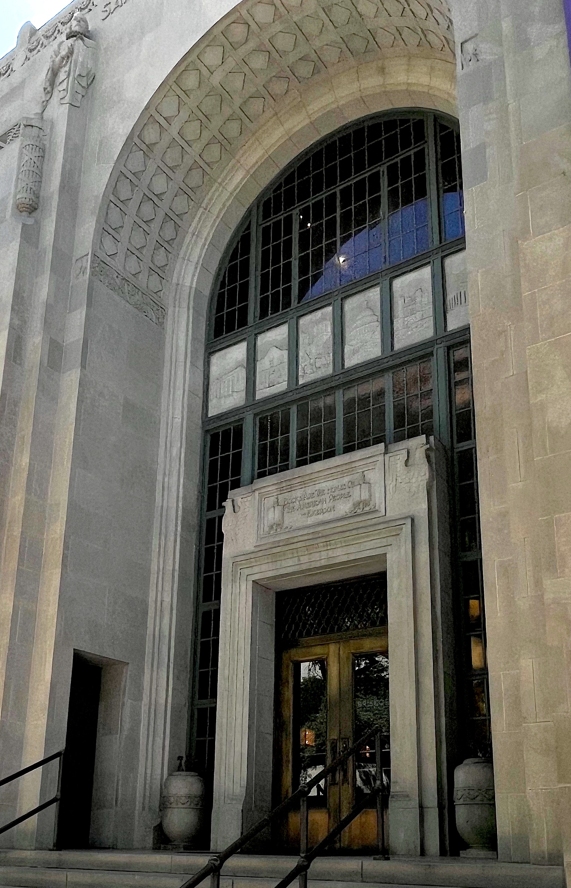
              

Library Main Entrance with Allegories
Green conceived of the building in the then-popular art deco style with clean geometric lines. The tall three- story facade was flanked by two single story wings.  Behind this the structure rose to the height of the facade; and contained the heart of the library, its book stacks. To the rear were two lower wings that matched in size those in front, also holding stacks.. The restrained decorations on its exterior echoed the refined purpose of the library with some literary mottoes thought appropriate by white masculine thinkers of the early 20th century. Over the Presa Street entrance surrounded with classical decorative motifs, a quote by the now-forgotten poet William Ellery Channing: "In The Best Books Great Men Talk To Us.  Give Us Their Most Precious Thoughts, And Pour Their Souls Into Ours." On the building's opposite side is one by James A. Garfield: "Next In Importance To Freedom And Justice Is Popular Education, Without Which Neither Freedom Nor Justice Can Be Permanently Maintained."  This one, surmounted by a frieze of a book within a rayed ring flanked by two Bison, seems ironic in the light of present-day book banning by our Texas legislature.


The inscription over the main entrance features the words of Ralph Waldo Emerson between two lions and two opened books: "Books Are The Homes of American People."  This doorway is recessed into a coffered niche that rises nearly the height of the facade, Higher up over the main doorway is a frieze of five venerable buildings which were considered important for for San Antonians: the Parthenon, the Alamo (the completed facade of 1849), Mission Concepción, the U.S. Capitol, the old court of King's College, Cambridge (supposedly the first public library in the world), and the Lincoln Memorial. Finally, flanking the arched portal to either side, near the top of the facade are two busts, to the left, Cervantes and to the right, Shakespeare. These figures represented two of the foremost figures of the European author's canon--Cervantes, perhaps because of the first Hispanic Europeans to settle San Antonio, the Canary Islanders, and Shakespeare for the city's subsequent Anglo-Saxon occupants?


The rest of the exterior decoration was sparing: a frieze of garlands along the upper story, and a couple of footed stands with urns on them on either side of the doorway. On the recessed wall by the Presa Street doorway was a plaque with the Gettysburg Address on it--a survivor of the library's Carnegie predecessor. The exterior was thus a cultured manifestation of the building's noble purpose--indeed the August 3, 1930 issue of the San Antonio Light called it "[An] Elaborate Monument to Literature."

Library Lobby


This dignified decor was continued in the library's impressive two-story lobby--an art-deco-neoclassic fusion. At its top, a gilded plaster ceiling of neoclassic coffering, with a frieze below it containing those buffalo nickel faces.  On three sides, the walls are divided into two decorative stories, the upper painted a dark green, the lower covered by wood paneling with a palmette frieze at its top.  Tying the two levels together are flat green pilasters, with gilded flattened

Library, Catalogues


capitals with geometric marking.  The wood paneled lower portion is divided on its fourth side (facing the entrance) by a wooden-railed balcony which forms a mezzanine; this creates a lower-ceilinged recess under it, which stretches beyond the lobby to the two side entrances.  The mezzanine was reached by a staircase with its risers covered in cowhide.  The staircase continued to a third floor that contained offices.


In addition, to the left and the right of the lobby was a reading room to the left and a room dedicated to children on the right (this room's function was later changed and the children's section was relocated to the basement).  The main entry to the library
was flanked by glass windows and pilasters of polished stone.
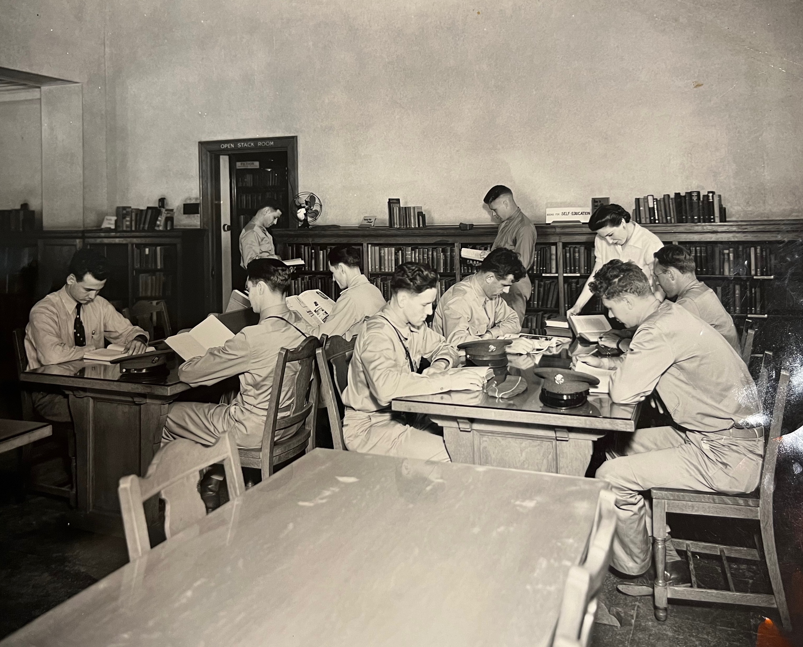

Library Reading Room
This was what you, in the citizen-borrower part of the building would see and use.  The greater, taller bulk of the building behind this contained six low-ceiling floors of stacks, which housed the
books--the heart of any library.  In 1930, the library operated on a closed stack system: except for some popular books on shelves in the reading room, and a limited access to some first-floor stacks off the same room, prospective readers and borrowers would select their choices from a card catalogue located along the lobby's back wall.  Once submitted, employees called runners would fetch the books from their designated place in the stacks. Everything was classified under a number code called the Dewey Decimal System, as it still is today in public libraries.  Back in the day every book had a corresponding typewritten catalogue card with author, title, and call number.  After the client received the book, they would go to the check-out desk located to the left front of the library.


At some point, the rather dimly lit lobby with its wall sconces and its art deco pendant lighting proved impractical for card catalogue scanning and book checkout space, and so drop fluorescent light fixtures were installed, partially obscuring the original coffered decorations above them. Wall air conditioners were also mounted into the windows flanking the main entrance.

Library with Air Conditioning units and fluorescent  lights


The library proved successful and popular.  Soon satellite branches popped up around the city, but this original building was its hub--until the collection and demand outgrew it in 1967, when it was moved. But just over a decade after its founding, changes were afoot.


____________________________________________________________________________


All black and white photos courtesy of San Antonio Public Library.  The colored one was taken by the author


There are two sources for the history of the site and the initial Carnegie Library: the first is Emily Crawford Wilson's introductory essay for the Briscoe's Catalogue, The West Starts Here, San Antonio, Briscoe Art Museum, 2023, pp.13-33.  The other is "210 W. Market St - A History," a handout published by the San Antonio Public Library Portal, n.d., which can be accessed at: https://guides.mysapl.org/libraryportal/BuildingHistory


For the 1930 library in its original state, see:  "New S.A. Library Opens its Doors to the Public,San Antonio Light,  Aug. 3, 1930, pp.1,22.

                                          The Procession by Paul Moore 


                                                    Part III - A Meditation


Paul Moore is certainly among the greatest sculptors of his generation, not only with collectors and admirers of American Western art, but anywhere, including numerous commissions for portraits of his contemporaries, public monuments, including the colossal Oklahoma Centennial Land Run Monument in Oklahoma City, a 365 foot epic consisting of 45 human figures and numerous horses and wagons--all life sized, to smaller compositions many of which depict scrupulously researched Native Americans of many different tribes.  In addition, he is a Professor of Sculpture at the University of Oklahoma and has passed his craft down to his sons. He is also a prolific collector of objects and artifacts and has a profound knowledge of the history of American sculpture.  There are two full-length interviews, one produced by the National Sculpture Society (2021) and the other (2017) in the Gallery of America series produced by PBS.  A grand selection of his varied works is available to see on his own website Crown Arts, Inc.  I give you links to all three below. So much has been written and videotaped about him and his body of work by so many who know him, that I urge anyone who is interested to seek expert information from the abovementioned sources.


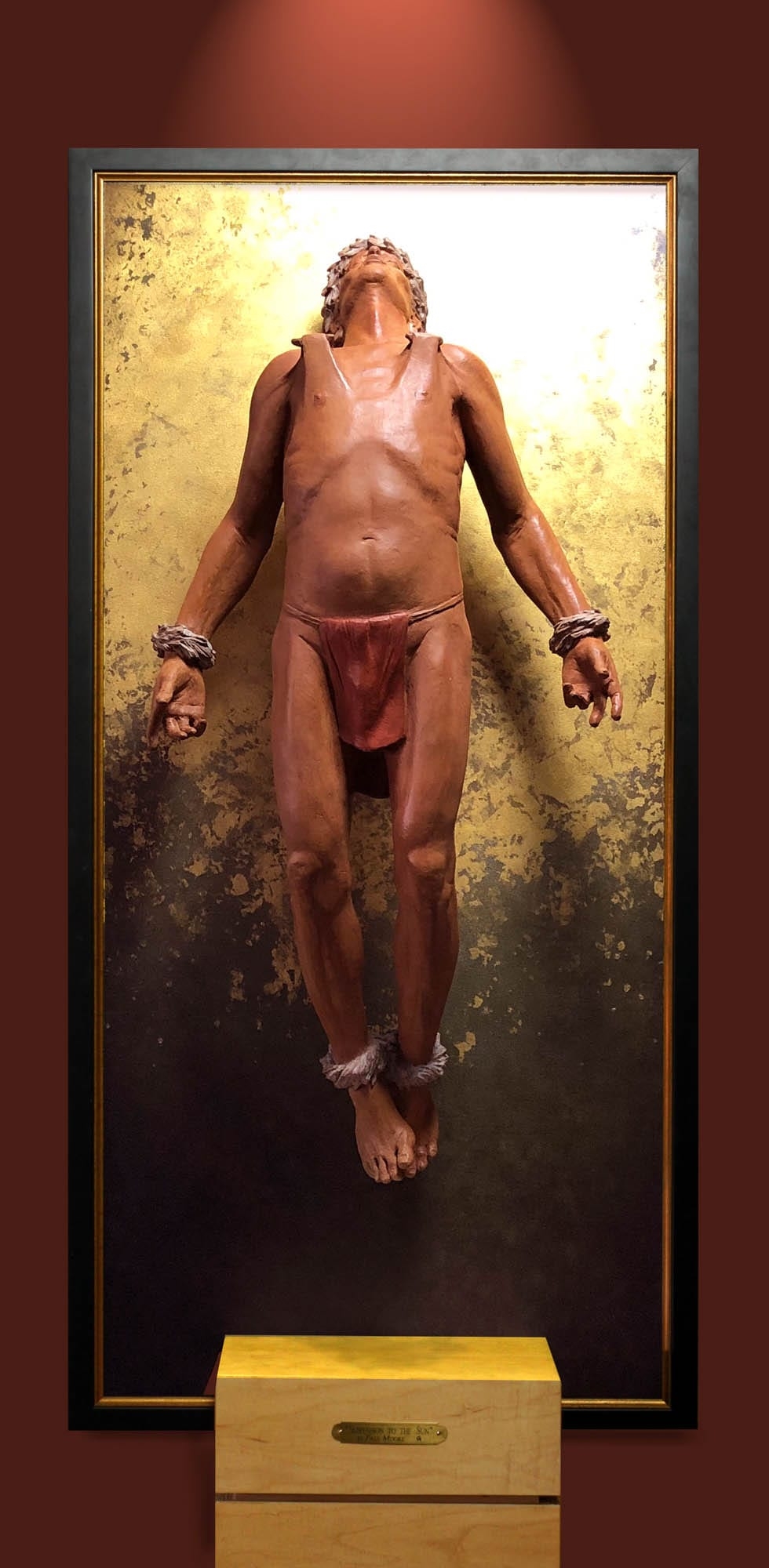
Here, I write only about two small pieces. I have never met Paul Moore, and my only direct experience of his work is The Procession, now in the collection of the Briscoe Museum, which was in the 2020 Night of ArtistsShow and a James Bowie Sculpture prize that year, (this work had also won the prestigious Prix de West the previous year), and another of his works Suspension To The Sun which was featured in the 2021 Night of Artists; I include a photo of it here with some trepidation since I do not know where it is now and who holds the copyright for the reproduction (I hope I will be forgiven).


Paul Moore - Suspension to the Sun

Both these works were done around the same period, during the time of Covid, and are part of a group of mixed media pieces that examine the fusion of Native American with Christian beliefs. Some are like altarpieces, and unlike The Profession, these images are confined to their European Gothic frames (except for a Bison head that rides outwards like a cuckoo clock when its doors are opened). Suspension to the Sunshows a single figure centered in front of a plain rectangular frame.  The figure is suspended above the ground by means of ropes (here invisible) tied to wooden pegs that pierce his shoulder muscles.


The inspiration for this, as Moore explains on his website, is the Mandan ceremony, called the O-Kee-pa, held in spring when young men of the tribe endured an initiation ceremony that lasted four days.  Part of it consisted of the young men having similar piercing of their shoulder and back muscles as well as by darts and suspended from the ceiling of the Mandan Medicine

George Catlin - Okee-pa Ceremony: The Cutting

Lodge by ropes.  This was only the beginning, for the suspension was not to kill, but an ordeal to achieve visions in a state of trance.  They then went through other ordeals.  George Catlin had been present at the ceremony in 1832 and recorded four episodes from it with broad brushstrokes. Catlin's rapidly-painted initiates look slender and ragged, and they are seen from the distance within the lodge.


Moore presents the man, but in a very different way.  The figure is presented frontally, his pierced shoulder muscles looking almost like straps.  His spread-out arms and hand gestures suggest endurance, and also part of his self-offering.  For Catholics, the frontal suspended figure, including the slightly joined feet, may evoke Jesus on the Cross, but his head, tilted backwards to the light, implies an ecstatic experience emphasized by the gold leaf behind him that reflects the studio lighting above it.  The closest thing I can think of is Caravaggio's Conversion of St. Paul, but that light-encompassing figure lies foreshortened away from the

Caravaggio -St. Paul

viewer on the ground, and he's struck blind by his vision. And the heroic nature of Moore's young man with a rope crown, which from the viewer's angle resembles a laurel wreath, tilts towards, and receives the light--an ecstatic vision that climaxes his ordeal. It's a depiction of the crowning moment of a vision quest, part of an age-old and universal initiation. This is a living hero--but all the muscular tension makes it hard to contemplate for long.


This work has a similar spiritual power to The Procession, but the effect on the viewer is different.  I as a viewer can receive a powerful spiritual jolt from Suspension, but its upward-gazing intensity can only inspire the onlooker for a short time, and we can never share it. The wooden block, placed in front of the picture with its label, is also a distancing mechanism. The viewer is not invited to participate in this ritual, but to experience it in their own inner thoughts.   The Procession is just the opposite: it appears to move towards you, soon you will be embraced by its spirituality--drawing you in.


___________________________________________


Paul Moore's Suspension in the Sun can be seen on his website: https://crownartsinc.com/art-gallery/ols/products/xn-suspension-to-the-sun-ol9lnb

Others in this same series can be accessed at the same website; click on the years 2019 and 2020.


George Catlin's Okee-pa scenes (1832) consist of four paintings.  Three are in the Anschutz Western Art Museum, Denver.  The fourth ("The Cutting Scene") is in the Denver Art Museum https://www.denverartmuseum.org/en/edu/object/cutting-scene-mandan-o-kee-pa-ceremony.  These scenes were reissued under Catlin's supervision as lithographs, starting in 1841, and he lectured on them too.  See also George Catlin and His Indian Gallery, Washington, Smithsonian Institution, 2002, pp. 48, 210-215.

                                         The Procession by Paul Moore:  


                                            Part II - Other Assorted Processions


Both composers and visual artists have had their hand in evoking processions in their respective media.  A lot of narrative musical compositions conjure them up as aural narratives, particularly in the late 19th and early 20th centuries.  Since music moves through time, it's easy to conjure up the auditory experience of a passing parade, soft in the distance, getting louder as it passes by, and then diminishing in volume as it moves away--continuity being established by a repeated cadence, so a person could imagine a passing caravan in Alexander Borodin's In the Steppes of Central Asia (1880), or a more dynamic one in Ottorino Respighi's Pines of Rome  (1924) where a ghost army of Roman Legionnaires emerges faintly from shadows along the Appian Way to stop very loudly in front of you.).  Even more relevant to Moore's work is Isaac's Albéniz' El Corpus en Sevilla (1906), for its similar theme and its cadence, though on a far more elaborate and theatrical scale.


To understand how singular Paul Moore's The Procession is in its visual impact and emotional charisma is, it's also worth doing a bit of classical art historical comparisons.  There are many works of visual art that have processions and parades as their principal subject.  The problem here is to show movement through static media. I am restricting my examples to religious processions, which offers examples going as far back as far as we have organized societies and artists to commemorate them.


A famous procession in Egypt, the feast of Opet was celebrated in Luxor from the New Kingdom right up to the introduction of Christianity.  It commemorated the season when the Nile flooded, bringing the time of farming, and was extended to fertility in general.  The parade was the grand finale, when images of the city's greatest gods, Amon-Ra, his wife Mut and their son Khons were ceremoniously carried on boat-like floats from Karnak to Luxor. This journey was depicted in a relief from the Red Temple of Queen Hatshepsut at Karnak, with marchers bearing the boat

Feast of Ophet Temple of Amon-Ra

containing the shrine of Amun-Ra.  Following Egyptian conventions at the time, the shallowly carved representation of marchers, bark and shrine is in a single visual plane, along with accompanying hieroglyphics in the same two-dimensional space.  The bearers are in identical poses, suggesting a cadenced stride of a military cohort.  Movement? Yes, but in two dimensions and not in your own viewing space. It's something you can read rather than taking in in with one glance.


Over many centuries, religious processions were generally shown with the participants moving along a horizontal plane, shown with far more three dimensionality, but always parallel to the onlookers, not intruding into their space. The original, brightly painted frieze of the Parthenon is a nice example: a horseman might twist on his mount, but neither he nor his gaze is directed out of his plane.


Gentile Bellini - Procession in St. Mark's Square

The same can be said of the marchers in Gentile Bellini's Procession in St Mark's Square (Venice, Accademia) : in spite of the deep perspective of the square behind them, the marchers are still seen marching parallel to the picture's viewer, but not deviating from their confined zone.


It's when we get to 19th and early 20th centuries that romantic narratives of religious processions really get going, the painted equivalents of Borodin, Sorolla and Respighi.  But how parades and their progress is conveyed has to be done statically, unless it is things like Chinese hand scrolls, where the time of a journey is sequenced by rolling through it, achieved by only unrolling and then rerolling a portion of it to reveal a moment of progress.


Solomon A. Hart -Simhat Torah at Livorno Synagogue
An example of a narrative of a procession in a single painting is Simchat Torah at Livorno Synagogue by the British-Jewish academician Solomon Alexander Hart in the New York Jewish Museum (1850).  It commemorates the annual celebration of the Torah.  In this scene all of the torah scrolls are being processed through this Italian synagogue by the leading members of the congregation, led by the Rabbi.  As in Moore's sculpture, the marchers of various ages wind from the ark where they are kept, behind the reader and some singers on the elevated bimah or
reading platform.  They are draped in prayer shawls as they carry the scrolls, covered richly colored cases and polished silver staves or crowns.  Unlike Moore, the action stays within the setting, and appears to be passing towards the right, where an elderly congregant walks to meet them so that he can touch the scrolls with his own shawl.  Other male figures, to the left and right, watch the scene in reverence. Maybe Livornese Jewish males dressed in such oriental robes for festivals back then.  Hart had visited the old synagogue in Livorno and this is an accurate recording of the building.  It is beautiful and sumptuous, but presumed spectators in front of the canvas are viewers only to a passing spectacle; they are not invited to participate. 


Ilya Repin Religious Procession in the Kursk Governate

Marchers and witnesses alike in Ilya Repin's Religious Procession in the Kursk Governate (1880-1883) (Tretyakov Museum) are also a passing spectacle, but on a much grander and more chaotic scale. A lot has been written about this painting and its societal commentary, and I give you references to the best of these analyses available online below.  The main point here is that like Hart's painting, the vast procession and its spectators are all conceived on a diagonal that passes to the right of the viewer, but not into his or her space and part of its purpose is to focus on varying individuals and the diverse roles they play.  The viewer is emphatically not a participant in the event nor is invited to be.


Closest in the shared tradition of Catholic holy religious processions to Moore's work is Joaquín Sorolla's Los Nazarinos (1914) showing a Holy Week Procession (which is close to Albéniz' musical procession too).  A group of hooded figures parade with a crucifix and a paso image of  the Virgin under a canopy, down an urban street in Seville--identified as so by the iconic tower of the city's cathedral in the background.  It has been observed, though, that there is no street in the city that offers this particular view of the tower; the black caparotes of the marchers, and the image of the Virgin are not specific to a particular confraternity or church. Though processing generally forwards, the figures are directed slightly to the left, as is the gaze of the left hooded

Joaquin Sorolla -Los Nazarenos

foreground figure, and the crowd of spectators hems the marchers in.  And there is a further difference: the Nazarinos painting is part of a large series of murals commissioned by Archer Huntington for the Hispanic Society in New York and carried out by Sorolla between 1911 and 1919.  The Nazarinos are located in a corner, with a much larger painting of bulls being wrangled to transportation at its left (El Encierro)at its left, and a painting of Toreros in Seville's bullfight to its right, and is therefore an incident within a much larger entity depicting various regions of Spain and their typical activities.


It can be said that the church in Moore's Procession is generic too.  He did small works of acrylic paint and gold leaf of various southwest mission facades, but the isolated one in The Procession appears more generic.  And none of these painted or sculpted comparisons discussed above have the same jolt of movement outwards, and the almost magic realism of the procession leader, at once someone identifiable and yet Everyman. Coming at you.


______________________________________________________________________________

Recordings of Borodin's Steppes exist in several versions in YouTube, for example https://www.youtube.com/watch?v=g4tlQxaHetI.  Those Legionnaires really march in a  remastered recording of Fritz Reiner: https://www.youtube.com/watch?v=Z9El5Hzh3jM, while Gustavo Díaz-Jerez rendition of Corpus is https://www.youtube.com/watch?v=8_55-4CpCro.  But there are many versions of each piece to choose from online. Have fun and close your eyes!


Feast of Opet relief shown is from the Red Temple of Opet.  https://www.nationalgeographic.com/history/history-magazine/article/ancient-egypt-royal-feast


An Explanation of the Parthenon frieze and its participants by Paulina Wegrzyn can be found at "The Parthenon Friezes: Their Story Explained" TheCollector.com, August 2, 2020, https://www.thecollector.com/parthenon-frieze/.


For Bellini's painting, see https://en.wikipedia.org/wiki/Procession_in_St._Mark%27s_Square


Chinese hand scrolls: https://www.metmuseum.org/toah/hd/chhs/hd_chhs.htm


Old photos of Livorno's synagogue before its destruction can be seen at https://livornodailyphoto.blogspot.com/2012/08/the-old-synagogue.html


For two of the best accessible analysis of Repin's monumental work, see the article by Ben Pollit for the Kahn Academy at https://www.khanacademy.org/humanities/becoming-modern/x4910f52e:eastern-europe-1800-1900/wanderers/a/ilya-repin-krestny-khod-religious-procession-in-kursk-gubernia

 And also the analysis by David, the author of a blog on Russian icons at  https://russianicons.wordpress.com/tag/ilya-repin/


On Sorolla see Wikipedia for information and a complete list of the Visions of Spain

paintings: https://en.wikipedia.org/wiki/Vision_of_Spain

A specific discussion of Sorolla's Nazarinos, its context and meaning is available at:

Dr. César Lopez Gomez- Joaquin Sorolla "Los Nazarenos," 1914. Nueva York, Hispanic Society of America -- https://cesarlopezgomez.com/joaquin-sorolla-los-nazarenos-1914-nueva-york-hispanic-society-of-america/


                                            The Procession by Paul Moore


I've written about this work for the Briscoe Museum catalogue, but it continues to move me every time I see it.  I wanted think and write more about it, so here goes (this will be a 3- parter)


                                               Part I - The Work itself


A religious procession winds towards us, apparently coming from the adobe church off to the right, its earthy color the same as the landscape around it.  Leading it is a middle-aged man, very much a portrait-like person with individualized features right down to his receding hairline and grayish braids, holding a processional crucifix of what appears to be polychromed wood.  Behind him is an orderly file of participants, those closest to him carrying an image of the Virgin Mary, her face in shadow under a makeshift canopy of what appears to be wood and canvas.  Everyone but the leader and one man to the left holding a sombrero, is dressed in blankets or shawls of browns and whites, draped over their hair as well as their bodies, muffling their faces so that their genders are unclear, and in many cases their facial features too. Most are of similar height, except for one child near the church.


Aside from white in the blankets and shoes and some clouds to the left rear, the only other color beyond shades of brown allowed is a light blue in the shirt of the procession leader, the cloak of the image of the Virgin and a strip of sky. Silver is also present on the halo of Christ on the processional cross, and the smaller crucifix carried the by marcher to the viewer's right of the leader.


The barrenness of the landscape with its few scattered shrubs (sagebrush?), the adobe church which seems part of the earth and rising from it, the generic features of the marchers and their blanket-mantles emerging, it seems, from behind the church, suggests the pueblo culture of New Mexico and Arizona, and the isolated location of the building out in the desert is deliberately non-specific.


The work is primarily bronze casting including its gilded "frame" and the reclining "ornamental" figures at the top, except for the pale green wooden table on which the framed scene rests, but this too is part of the sculpture, so I guess it's really mixed media. Several features make it wonderfully deceptive. In the composition proper, the relief ranges from low to completely in the round for the leader, his crucifix, and the two figures behind him.  But the church towers also project beyond the "frame," and the canopy over the Virgin image casts a shadow.  The ground slopes outwards so that the foreground figures literally enter the viewer's space, and the bottom of the frame is no longer an ornamental boundary as the sloping ground continues outwards.  


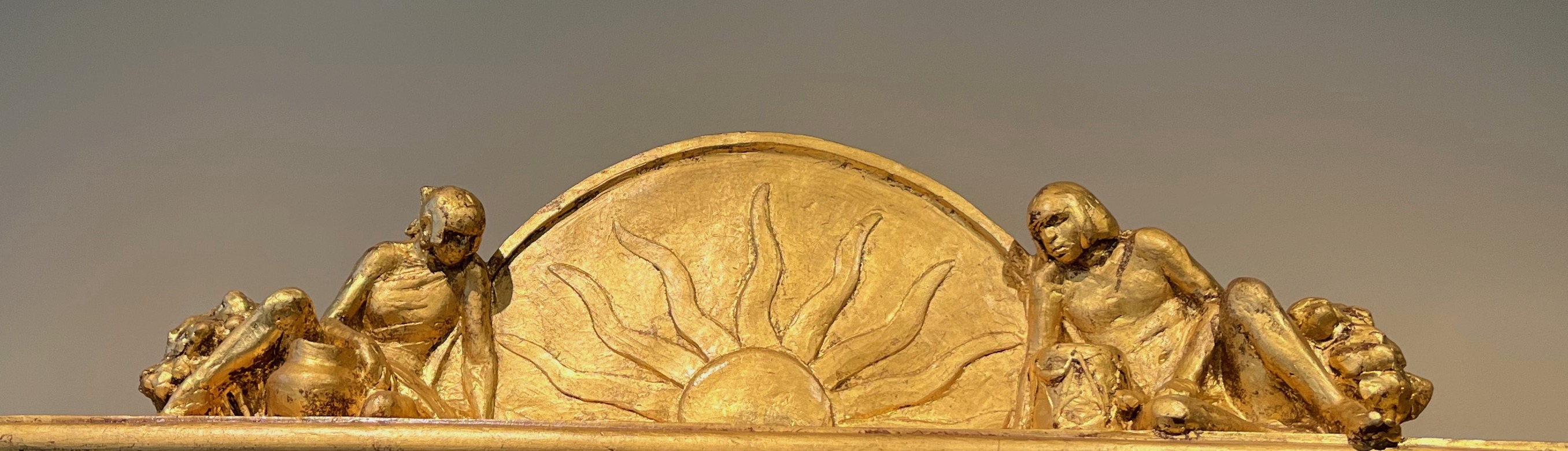
The varying levels of relief and projecting figures and plants also cast real shadows, which ca vary with the way the work is lit, though the patinated shadow cast by a crucifix that appears at an angle behind the leader and over the carriers of the image of the Virgin, made of brownish and blackish tones seems to suggest a different cross altogether--but where is it?. The gilded frame itself with its classical brackets and dentils, as well as the reclining figures on top, evoke a traditional Renaissance-Baroque altar, but the two figures have features and hairstyles of native Americans, as does the pot by the one to the left.  


Traditional Christian altarpieces in the semicircle they flank would have the space there occupied by a Christian icon (Trinity, God the Father, etc.) but here it is a rayed sun. The only additional Christian symbol is the roughly painted red Sacred Heart painted on the real but worn-appearing wooden table below--all of this constructed and decorated too by Moore himself.


The bronze composition achieves its earthily multicolored effects by the application of subtly colored patinas. and by making the areas beyond the central plaque of the composition and the "frame" neutral, further enhances the aura of processional theater.


If a person stands far enough away from the sculpture (in the Briscoe Museum this is possible), they could almost believe that the figures are human, and that they are coming from the church or from behind it, and really moving slowly, stepping into your space and will soon reach you, and then they will be life-sized.


Paul Moore's artist's statement about this work pretty much sums it up:


            "The Procession" was made to honor the religious aspect of the various Pueblos where     90% of the Pueblo people are Catholic with a blending of their ancient culture intertwined with Christianity. Throughout the year various processions are performed to   honor Jesus Christ, the Virgin Mary and the lives of various Saints. I created this piece to look like an alter is coming to life and walking out from the bonds of the frame like the believers do in taking their faith to the masses.


To this writer, the key to this profoundly emotional work is the figure of the leader with his individualized facial features and his dignified demeanor.  He is both conscious of his role but also totally absorbed in his own spiritual experience as he turns his head slightly to the right, though he walks straight on.  As he appears to walk forward, the position of his feet and his posture suggest the slow dignified cadence of the procession he leads and how he defines this


rhythm.  The people he leads coalesce behind him into a complete spiritual entity.  Not only does the terrain physically sloping outwards help suggest this (the foreground plants project too), but the artist manipulates the perspective of the figures behind him and the foreshortening of the church and combines this with actual shadows cast by those elements in highest relief and full three dimensionality. It's hard to determine where two dimensionality becomes three.


From an art historian's point of view, Moore combines the literally rendered with suggestive abstraction, and blurs the line between art and life; when you look at the desert setting and it multiple dimensions, the flat area behind the composition proper and the projecting elements of the frame suddenly pulls the viewers up short to remind them it's just a bronze plaque.


He also subtly combines some artistic conventions of a framed altarpiece in Catholic, European based tradition, and then changes and modifies this tradition both by the reclining figures and sun symbol of indigenous belief, and the deconstruction of the frame at the bottom, which then is seen to be resting on a rough, aging table, reminding us that the whole bronze composition above really is just an altarpiece.


            But is it?

            (to be continued).


____________________________________________________________________________

Paul Moore's Artist Statement can be found athttps://crownartsinc.com/art-gallery/ols/products/the-procession


Carmen Tafolla, San Antonio's Poet Laureate of 2015, penned a piece of ekphrastic poetry in response to Moore's piece.  You can watch and hear her reading it aloud in the Briscoe's sculpture garden at: https://www.facebook.com/watch/?v=1136575313578044

The Briscoe Museum and its Buffalo Nickels


             The Briscoe Museum of Western Art has as its logo an American Bison inscribed within a circle.  It clearly invokes the "Buffalo/Indian Head" nickel, one of the most iconic of U.S. coins of the 20th century.  The coin was minted between 1913 and 1938.  It was also one of the most problematic. There was a challenge to the design submitted by James Earle Frazer in 1912 by the Hobbs company, since they feared that their detection machines couldn't distinguish between the authentic nickel and slugs, which delayed its release by a year. Problems with its indistinct striking caused them to wear out quickly, no matter what modifications were made to their design over the years, do new dies had to be made more often than usual..

On the other hand, the nickels proved popular.  Frazer already had a sound reputation as a sculptor and is probably best remembered for his highly acclaimed work End of the Trail. At the time of the coin's release, there was speculation as to which Native American leader and 

which particular bison were Frazer's models: the head of the chief proved to be a composite, and the bison model apparently came from the Central Park Zoo in New York City.  They continued to be in circulation for at least two decades after the Mint switched to the Jefferson 

design in 1938


As an architectural motif, they were popular during the 1920's and 1930's, the period of 

the art deco style in many civic-minded buildings all over the United States, including two in San Antonio. The earlier one is the Frost Bank building designed in 1922 by the Sanguinett and


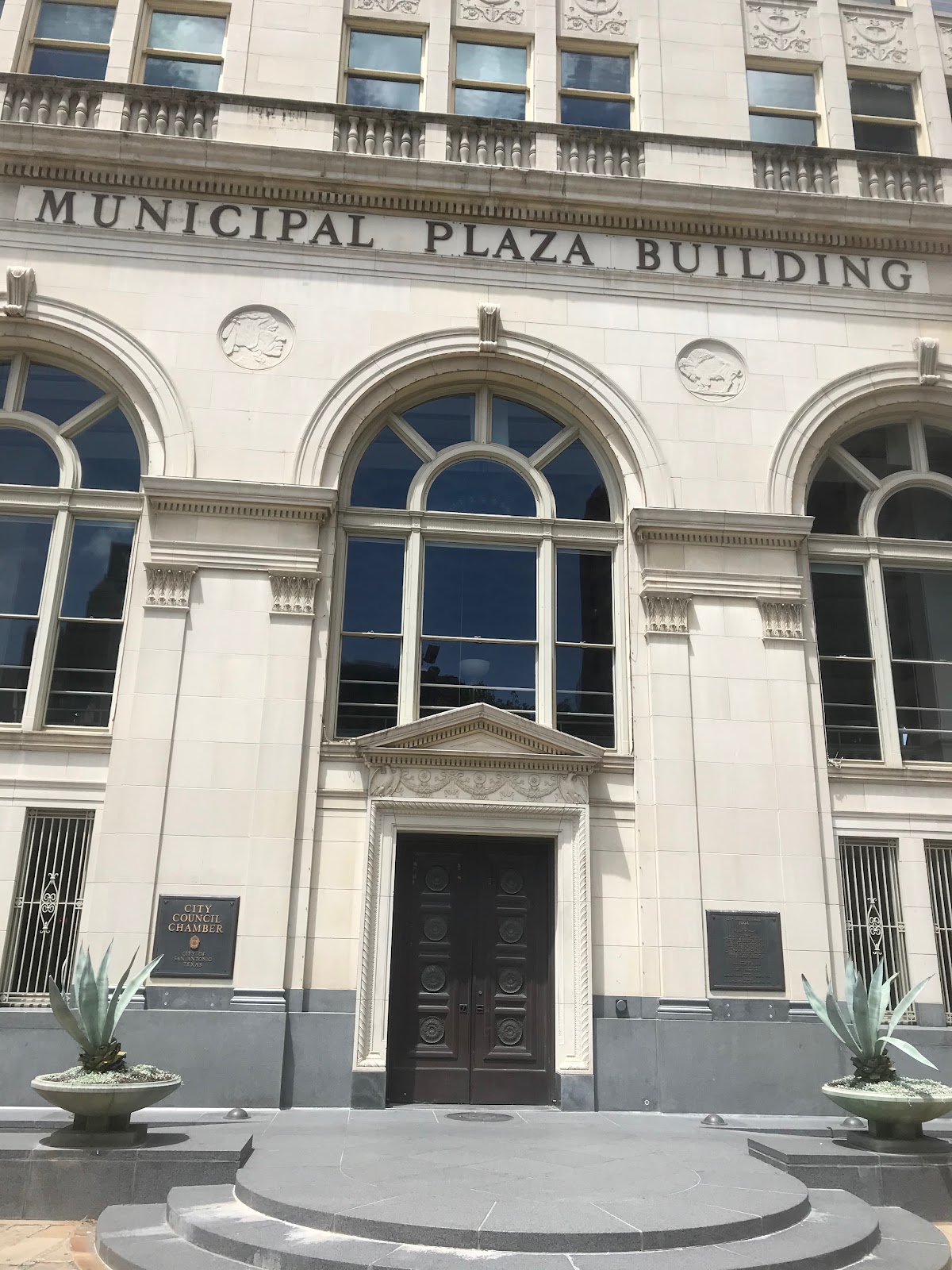
Staats firm, located on Main Plaza next to San Fernando Cathedral.  This building now houses the San Antonio City Council Chambers and has medallions of the nickel's two faces both on three sides of its facade, and inside, on the chamber's mezzanine.  The other is on the interior frieze right below the coffered ceiling of the 1930 San Antonio Public Library Building's lobby designed by Herbert S. Green, now the Briscoe Museum of Western Art.


Both the coffering and the frieze below it had been obscured, blackened by cigar smoke and pure neglect, and in the time that the building served as the Hertzberg Circus Museum between 1968 and 2001, it seems nobody looked upwards, the room being filled by circus paraphenalia.  When the structure was renovated more than a decade later in preparation for its transformation into the Briscoe Museum, the rich, but battered original ceiling was revealed.  Lake Flato Architects designed the new adjacent Guenther Pavilion, and Restoration Associates lovingly restored the original library building, including the art deco light fixtures, sumptuous coffered ceiling of gilded cast plaster, and its buffalo nickel frieze of the same material but in silver--a serendipitous find for a Western themed museum!


Now re-gilded with silver mica pigment, the alternating nickel faces with decorative framing (and some decorated fire spigots as well as plain disks punctuating them) shine again and can be seen in closeup on the Mezzanine level.  The Native American profile head and the bison, its curving posture gracefully fitting its circular shape, and even their smooth surfaces, suggesting some wear as found on most of the circulating nickels help tie the structure and its new function together. Their silvery coloring contrasts with the gold of the pilaster capitals below them and the coffering above.  There are no issue dates or inscriptions as found on the real coins, or the subtle variations the real coin suffered over the years of its issue, just the two emblematic images.


The collection of the Briscoe  offers numerous depictions of bison, including the Hulking Bull Bison, by Ken Ullman located on the Presa Street side of the Museum. But what makes the buffalo nickel theme even more important for the Briscoe is the presence in their collection of two works, one in a suite of prints, the other a pair of sculptures that invoke the same coin.


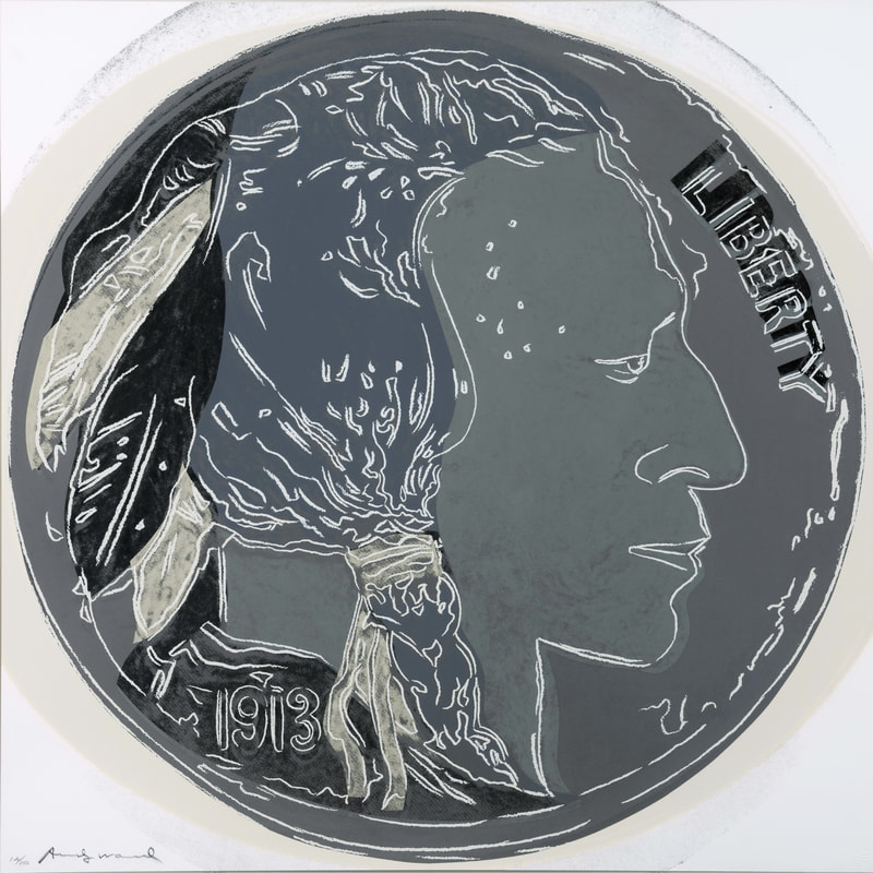
The prints are two serigraphs by Andy Warhol from the series Cowboys and Indians, published in 1986, a year before the artist's death.  The full portfolio in an edition of 250 consisting of ten images of Western heroes taken from existing photographs selected by Warhol and also several Native American artifacts that he photographed at the Museum of the American when it was still located in New York, plus the "Indian Head" side of the Buffalo Nickel.  The bison face of the nickel was included in a set of four additional proofs printed in a more limited edition of 46 in various colors.  The Briscoe Museum has both sets.

.

The serigraph or silk screen process produces multiple compositions of flat color, though color shade hatching can be achieved by the use of various screens. Because it is a multiple process, the color of individual prints of each composition can be varied. 


The two faces of Warhol's nickels are very limited in color, in contrast to the pop-art bright hues of other prints in the series (though in some of the other trial proofs, he experimented with bright colors).  The Briscoe's "Indian Head" uses two shades of gray, with black and white outlines and accents.  The model must have a coin of the first year of issue, for it bears a date of "1913." Warhol also reproduces the word "Liberty" found on the coin. He has taken a few liberties with his design, the "3" being rounded rather than the flat-topped one on the coin, and the figure's features are flatter, with the eye more defined.  Darker accents are in some of the feathers, the chief's collar, and behind part of the "Liberty" inscription, while white accents other feathers and the outlines of the profile and hair; the hair itself is a slightly darker gray than the skin. White and black lines and areas suggest slight wear.


The bison is similarly treated, though here the animal is darker gray than the ground it stands on, and the background is largely an off-white, as if the coin was seen in a raking light.  The mottled ground and the black behind the upper text of "United States of America" and "E Pluribus Unum" also suggests wear, while white lines and some black smudges give the animal a slight sense of depth.  The "Five Cents" below its feet are more irregular than that of the coin.


 Taken all together, the two prints achieve both the characteristically surface-oriented style of all of Warhol's works and capabilities of the medium, and the iconic logo-quality of a coin.  Given his inclination to often print multiples within the same compositions, such has his well-known "Campbell's Soup" prints, Warhol could have very well done a frieze of nickels himself.


The last nickel interpretation in the Briscoe couldn't be any more different from Warhol's, except that the fact that it was made by its artist in a multiple edition, in this case seventeen to twenty-one at a time.  These are the Indian Head and Buffalo sculptures in cast metal by Greg Woodard. There are two editions of each, one in steel and another, subsequent one in bronze. 


Though cast in multiples, Woodard applies patina to each piece individually, so that each is subtly different. These images are fully and sometimes jaggedly three dimensional.  It's as if the artist managed to inflate both Native American and Bison not only to their full volumes, but he did it so powerfully that he burst through and shattered their circular frames and their inscriptions too. The bison is fully visible from both sides since the circle is blown out, and its rough coat made to appear even rougher by its varied patina. Most of the inscription "United States of America" can be seen at its tattered top, while the "Five Cents" at the bottom is intact.  But Woodward has gone further, by giving us a view of the non-existent but hypothetical other side, he has included the word "Liberty" here--actually to be seen on Chief side of the real coin.  On this side, he has also provided some dusty ground beneath the bison's feet--perhaps a reference to the rough ground seen in the original 1913 nickel, which disappeared in later dies of the coin. In some states of the casting, the bison's head projects beyond the nickel's circular shape.


The cast of the Native American seems to have exploded its frame even more, so the upper circle is partially broken off.  Most of the head is placed in front of the broken circle; again, it is completely three dimensional. "LIB," a fragment of the word "Liberty" is stuck to the chief's forehead, while part of the inscription "United States" from the bison side is seen on the broken circular section beneath his neck, while the date "1913 is to the left of that. As in the case of the Warhol, the chief's hair is darker than his face, but here it is much darker.  Like Woodard's Bison, the surfaces are craggier, even to the point of a gouge out of the chief's cheek: this is a sculpture, after all, not the person himself.


Woodard has done other deconstructed coins; the Indian Penny, with this chief's war bonnet projecting far above the round coin boundary, and the Lincoln Penny, where the President appears in front of the coin, here reduced to a crescent moon.  The two sides of the Buffalo Nickel and the Indian Nickel are the only ones at least so far inspired by both faces of the coin.


No viewer can have trouble identifying the source for all the three examples in the museum discussed here, even though by the present date, few if any buffalo nickels remain in circulation.Given the western art mission of the museum, nothing could be more appropriate, tying works of art with a utilitarian United States currency.  It is also a really appropriate choice as the Briscoe's advertising logo!

______________________________________________________


Wikipedia's article on the Buffalo Nickel is a reliable source for the coin's history: https://en.wikipedia.org/wiki/Buffalo_nickel


For the Nickels on the City Council Building, see: http://txstartrail.com/OldFrostBankMunicipalPlazaBuilding1922.php


For the restoration of the Library for the Briscoe Museum: https://www.mysanantonio.com/entertainment/arts-culture/article/Buildings-blend-old-new-with-eye-on-history-4905025.php


An excellent discussion of Warhol's Buffalo Nickels and the entire print set is available is the thesis by Seth Hopkins, director of the Booth Museum, available on the Volgistics site for Briscoe docents.  An additional discussion of Hopkins and his interest in Warhol can be found at: https://www.forbes.com/sites/chaddscott/2019/09/24/booth-western-art-museum-sheds-new-light-on-andy-warhol-with-exhibit-warhol-and-the-west/#1276b08c4609


Information on Greg Woodard is available through the website of his principal gallery, Altamira Fine Arts: https://www.altamiraart.com/artists/5-greg-woodard/biography/, and Woodard's works: https://www.altamiraart.com/artists/5-greg-woodard/works/

William Herbert Dunton (otherwise known as Buck), Illustrator

  William Herbert Dunton (otherwise known as Buck), Illustrator     William H. Dunton: Vaquero (1909); Briscoe Museum                   He s...